-
[CSS/Side Lib.] Emotion.jsFront-End(Web)/HTML, CSS 2022. 7. 21. 00:35반응형
🧐 서론
작년, React 개발을 막 시작할 때 Styled-Components 라이브러리에 대해 포스팅하면서 CSS-in-JS를 같이 언급하였다.
CSS-in-JS는 말 그대로 스타일 정의를 css파일이 아닌 JS로 작성된 컴포넌트에 삽입하는 기법이다.
그렇기에, 컴포넌트 단위로 개발하는 모던 프레임워크에서 각광받는 기법이며, Styled-Components, Emotion.js 등이 대표적인 CSS-in-JS 라이브러리로 사용되고 있다.
CSS-in-JS는 컴포넌트 단위 개발 외에 아래와 같은 장점들, 그리고 trade-off성 단점들을 가지고 있다.
[장점]
- 컴포넌트 내에 CSS를 작성하므로, 별도의 stylesheet 파일을 관리할 필요가 없다.
- CSS 모델을 Global 레벨이 아닌 컴포넌트 레벨에서 추상화하여 관리가 가능하다.(모듈화) 이러한 모듈 간의 공유 역시 용이하다.
- Javascript와 CSS 간의 상수, 함수를 쉽게 공유하여 JS환경을 최대한 활용할 수 있다. (Props, State 및 함수로직 등)
- 별도의 className을 고민할 필요가 없다.(보통, 짧은 길이의 유니크한 클래스명을 자동으로 해싱하여 코드 경량화)
- 자동으로 vendor-prefix를 붙여준다.
[단점]
- 러닝 커브 (기존 CSS와는 다른 스타일링 기법)
- 새로운 의존성
- 별도의 라이브러리를 설치하므로 번들 크기가 커진다.
- 인터렉션 페이지의 경우 CSS파일에 비해 성능이 저하될 수 있음
이번 포스팅은, Styled-Components만큼은 아니지만 CSS-in-JS로 흔히 사용되는 Emotion.js에 대해 정리하려고 한다.
* 지금 회사가 Emotion.js를 쓰기에 작성하게 되었으며, 기본적인 문법부터 이를 썼을 때 장점이 무엇인지 나름대로 고찰해보고자 한다.
👩🎤 Emotion.js 란?
- Runtime vs Zero-Runtime CSS-inJS
위에서 CSS-in-JS의 개념에 대해 간단하게 소개했고, 이를 다시 분류하는 runtime, zero-runtime이라는 개념을 정리하고자 한다.
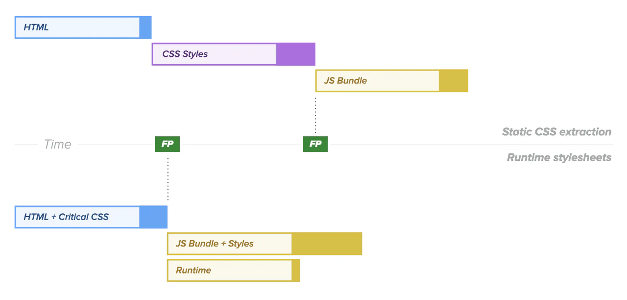
1) Runtime : styled-component, emotion
JS 런타임 시, 필요한 CSS를 동적으로 만들어 <style> 코드를 삽입한다. (배포모드에선, StyleSheet를 CSSOM에 주입)
- CSS 파일을 생성하지 않기에 Webpack 등에서 css-loader가 필요없다.
- 런타임에 동적으로 스타일을 생성하기에 수시로 변경되면 오버헤드가 발생할 수 있다. (스크롤, 드래그 앤 드랍 애니메이션 등)
2) Zero-Runtime : linaria, vanila-extract

런타임에 CSS가 얽혀있지 않아 페이지 로드가 빠르며, 빌드 타임에 CSS를 생성하므로 Webpack 설정이 필요하다.
- Props 등 변화에 따른 동적인 스타일은 CSS 변수를 통해 적용
- 런타임에 CSS Polyfill(CSS 변수적용 등)을 사용할 수 없어 브라우저 버전 이슈가 있을 수 있음
- CSS styles가 모두 로드되어야 첫 paint를 시작하므로, 런타임에 비해 load는 빠르나 paint는 느릴 수 있다.
3) Near-Zero-Runtime : stitches
Runtime과 Zero-Runtime 각각의 문제를 해결한 타협안이자, SSR에서도 잘 동작한다.
런타임에 각 CSS 프로퍼티가 Atomic CSS처럼 적용되어 클래스로 반영해준다. (대표적으로 tailwindcss)
const StitchesButton1 = styled("button", {
    color: "red",
    fontSize: 24,
});

const StitchesButton2 = styled("button", {
    color: "red",
    fontSize: 24,
});
당연히 어느 방법이 정답이다는 없으며, 상황별 적합한 라이브러리를 채택하는 것이 중요하겠다.
- 개요
Emotion은 JS로 CSS 스타일을 작성하기 위한 라이브러리이다. (CSS-in-JS)
Nested Selector, Media Query 등이 적용되어 작성이 간편하며, 동적 스타일 및 재사용성/확장성이 용이하다.
스타일 역시 String(Template Literal) 방식, Object 방식 2가지로 작성이 가능하며, 클래스 자동생성도 된다.
공식문서는, 위와 같은 기능들로 우수한 DX(Developer Experience, 개발 경험)를 제공하며,
Framework Agonostic(프레임워크를 사용하지 않는 것), use with React(리액트 전용) 2가지 사용성을 제공한다고 소개한다.
우리는 use with React(@emotion/react)를 중점적으로 알아보겠다.
* Framework Agnostic은 Emotion을 사용하는 간단한 방법으로, css 문법을 사용하나 @emotion/react와 내부 원리가 조금 다름
// 설치
npm i @emotion/css
// 사용예시 import { css, cx } from '@emotion/css' const color = 'white' render( <div className={css` padding: 32px; background-color: hotpink; font-size: 24px; border-radius: 4px; &:hover { color: ${color}; } `} > Hover to change color. </div> )👩🎤 Emotion.js 문법 (in React)
React에서는 1) @emotion/styled 패키지를 통한 styled component 패턴, 2) @emotion/react 패키지를 통한 css Prop 패턴 2가지 문법으로 구현이 가능하다.
1. @emotion/styled
// 설치
npm i @emotion/styled
yarn add @emotion/styled
// 사용예시 import Link from "next/link"; import type { NextPage } from "next"; import React from "react"; import styled from "@emotion/styled"; const HomePage: NextPage = () => { return ( <main> // Styled Component <Header dark={!true}></Header> <div> <Link href="/pagination?page=1"> // Styled Component <StyledLink>pagination</StyledLink> </Link> <Link href="/infinite-scroll"> <StyledLink>infinite scroll</StyledLink> </Link> </div> </main> ); }; export default HomePage; const Header = styled.div<{ dark: boolean }>` display: flex; justify-content: space-between; align-items: center; padding: 20px; background-color: ${({ dark }) => dark ? '#777' : '#eee' }; color: ${({ dark }) => dark ? 'white' : 'black' }; `; const StyledLink = styled.a` display: flex; justify-content: center; width: 240px; padding: 20px; border-radius: 12px; background-color: #222; color: #fff; font-size: 24px; & + & { margin-top: 40px; } `;<Header>, <StyledLink> 를 보면 기존의 styled-components 라이브러리와 문법이 똑같다는 걸 알 수 있다.
(props를 통한 스타일 분기, 가상 선택자, Nested Styling 등)
* Styled Component Selection (as CSS Selector)
import styled from "@emotion/styled/macro";

const EmotionChildBox = styled.div`
  background-color: yellow;
  font-size: 20px;
  width: 200px;
  padding: 20px;
  margin: 20px;
  color: "black";
  border: 1px solid black;
  border-radius: 4px;
  text-align: center;
  &:hover {
    background-color: orange;
  }
`;

const EmotionParentBox = styled.div`
  ${EmotionChildBox} {
    color: red;
  }
`;
Emotion에서도 이전에 만든 styled component를 선택자처럼 가져올 수 있다. 단, 이를 위해 Babel Plugin을 설치해야 한다.
// 설치
yarn add --dev @emotion/babel-plugin
// .bablerc { "plugins": ["@emotion"] }* Object Styles
@emotion/styled 에서도 String 만이 아니라 Object 형태의 스타일링도 지원한다.
import styled from '@emotion/styled'

const Button = styled.button(
  {
    color: 'darkorchid'
  },
  props => ({
    fontSize: props.fontSize
  })
)

render(<Button fontSize={16}>This is a darkorchid button.</Button>)
2. @emotion/react
// 설치
npm i @emotion/react
yarn add @emotion/react
// 사용예시 /** @jsxImportSource @emotion/react */ import Link from "next/link"; import type { NextPage } from "next"; import React from "react"; import styled from "@emotion/styled"; import { css } from "@emotion/react"; const HomePage: NextPage = () => { return ( <main> <Header dark={!true}> <Link href="/"> {/* 1) css Prop - Object Styles */} <span css={{ fontSize: 32, fontWeight: 700, }} > HAUS </span> </Link> <Link href="/login"> {/* 2) css Prop - String Styles */} <p css={css` color: #087c53; font-size: 20px; `} > login </p> </Link> </Header> {...} </main> ); }; export default HomePage; // ...css Prop은 별도의 styled component를 제작하지 않고, HTML 태그에 css라는 Props를 전달하여 스타일하는 기법이다.
위처럼, Object 형태로 전달하는 방법과 css 메서드를 통해 Template Literal로 전달하는 방법 2가지가 있다.
특히, 객체 스타일링에선 숫자값만 작성해도 자동으로 px로 변환해주는 것이 특징이다.
* JSX Pragma
최상단의 /** @jsxImportSource @emotion/react */ 문구를 볼 수 있는데, 이는 css Prop을 사용하기 위한 JSX Pragma 이다.
스타일 부분을 컴파일할 때, React.createElement가 아닌 emotion의 jsx() 함수를 사용하기 위한 설정이다.
// tsconfig.json

 {
   "compilerOptions": {
     ...,
     "jsxImportSource": "@emotion/react"
    },
 }
TS의 경우 위와 같이 tsconfig.json에서 설정이 가능하나, v5까지는 에러가 발생하였기에 100% 안전한 방법은 아직 아니다.
yarn add @emotion/babel-preset-css-prop//.babelrc .babelrc{ ..., "presets": ["@emotion/babel-preset-css-prop"] }혹은, Babel을 사용중이고 매번 Pragma를 작성하는게 번거롭다면, 위처럼 바벨 프리셋을 설정해주면 된다.
3. Composition
기존에 제작한 복수의 css 스타일을 사용하고자 할 때 유용한 문법이다. 스타일들을 배열 형태로 css Prop으로 넘기면 된다.
// ...

// css Composition #1
const flex = css`
  display: flex;
  flex-direction: column;
  justify-content: center;
  align-items: center;
  height: 90vh;
  border: 2px solid blue;
`;

// css Composition #2
const mt = (value: number) =>
  css`
    border: 2px solid green;
    margin-top: ${value};
  `;


const HomePage: NextPage = () => {
  return (
    <main>
      {...}
      <div css={[flex, mt(40)]}>	// Composition Prop
        <Link href="/pagination?page=1">
          <StyledLink>pagination</StyledLink>
        </Link>
        <Link href="/infinite-scroll">
          <StyledLink>infinite scroll</StyledLink>
        </Link>
      </div>
    </main>
  );
};

export default HomePage;
위처럼, flex와 margin을 위한 각각의 css가 제작되었고, 이를 하나의 엘리먼트에 같이 적용하고자 할 때 Composition을 사용한다.
css Prop을 Array로 할당하며, 여기엔 부여하고자 하는 css 메서드들을 넘겨주면 된다.
Composition은 추가적인 스타일링을 위해 class를 새로 부여하거나 !important 문법을 적용할 필요가 없다는 것이다.
css Prop에 추가하고자 하는 css만 넣어주면 된다. 이 때, 배열의 끝 요소일수록 우선순위를 가지게 된다.
4. Media Queries(반응형)
Emotion 역시 반응형 구현을 위한 문법들을 지원하고 있다.
기본적으론 아래 css(혹은 styled)의 리터럴 내에 작성하면 되나, 이는 분명 생산성과 재사용성이 좋다고 볼 수 없다.
import { css } from '@emotion/react'

render(
  <p
    css={css`
      font-size: 30px;
      @media (min-width: 420px) {
        font-size: 50px;
      }
    `}
  >
    Some text!
  </p>
)
* facepaint - Reusable Media Queries
// ...

const mq = [1024, 768, 500].map((bp) => `@media(max-width: ${bp}px)`);

const HomePage: NextPage = () => {
  return (
    <main
      css={{
        [mq[0]]: {
          backgroundColor: "blue",
        },
        [mq[1]]: {
          backgroundColor: "red",
        },
      }}
    >
    // ...
먼저, breakpoints에 해당하는 너비값들의 배열로 @media String 배열을 만든다.
다음으로, Object Styles의 경우 각 String 값으로 프로퍼티로 형성하고 그 안에 다시 객체 형태로 스타일링을 하면 된다.
String Styles의 경우, Styled-Components와 동일하게 Literal 내에 ${} 안에 String 값을 넣어주면 된다.
위와 같은 프로퍼티 설정을 매번 하기 번거로울 것이며, 이를 심플하게 만들어주는 게 바로 facepaint 패키지이다.
// 설치
npm i -S facepaint
yarn add facepaint
// 사용예시 import facepaint from 'facepaint' const breakpoints = [576, 768, 992, 1200] const mq = facepaint(breakpoints.map(bp => `@media (min-width: ${bp}px)`)) render( <div css={mq({ color: ['green', 'gray', 'hotpink'] })} > Some text. </div> )예시처럼 적용이 가능하며, 배열의 맨 처음값이 default, 그 이후로는 각 breakpoint에 해당하는 값으로 설정된다.
* 단, facepaint는 오직 Object Styles 에서만 사용 가능
4. Global
Emotion 역시 Styled-Components의 createGlobalStyles() 처럼 전역 스타일링을 위한 문법이 존재한다.
@emotion/react 패키지의 <Global> 태그를 사용하며, 여기에 styles Props로 스타일을 부여하면 된다.
import { Global, css } from '@emotion/react'

render(
  <div>
    <Global
      styles={css`
        .some-class {
          color: hotpink !important;
        }
      `}
    />
    <Global
      styles={{
        '.some-class': {
          fontSize: 50,
          textAlign: 'center'
        }
      }}
    />
    <div className="some-class">This is hotpink now!</div>
  </div>
)
5. Theming
Emotion에서도 theme 설정을 위한 ThemeProvider를 제공하고 있다.
공통으로 사용할 속성값들을 저장하기 위해 보편적으로 사용되며, 이 값들을 Props로(as Styled-Components) 혹은 객체 자체로도 가져올 수 있다.
1) theme 객체 생성
먼저, 공통 속성값들로 사용할 key-value 값들을 theme.js 파일에 객체로 선언한다.
// src/styles/theme.js

export default {
  color: {
    1: "red",
    2: "blue",
  },
};
2) ThemeProvider 설정
다음으로, theme를 제공할 엘리먼트를 <ThemeProvider> 태그로 감싼다. (통상, 전역에 공유되므로 top level에서 랩핑)
태그의 theme Props에 위에서 선언한 theme 객체를 할당하며, 영역 내에서 context로 제공되므로 theme이 수정되면 리렌더링된다.
import type { AppProps } from "next/app";
import React from "react";
import { Global, ThemeProvider } from "@emotion/react";

import GlobalStyle from "../styles/GlobalStyle";
import theme from "../styles/theme";

function MyApp({ Component, pageProps }: AppProps) {
  return (
    <ThemeProvider theme={theme}>
      <Global styles={GlobalStyle} />
      <Content>
        <Component {...pageProps} />
      </Content>
    </ThemeProvider>
  );
}
3) theme 프로퍼티 사용
css Prop에서 theme 매개변수로, styled에서 props로, useTheme 훅을 통해 객체를 직접 사용하는 3가지 방법이 있다.
// 1. css Prop - props 콜백에서 theme 매개변수 활용

import { ThemeProvider } from '@emotion/react'

const theme = {
  colors: {
    primary: 'hotpink'
  }
}

render(
  <ThemeProvider theme={theme}>
    <div css={theme => ({ color: theme.colors.primary })}>some other text</div>
  </ThemeProvider>
)
// 2. styled component - styled 내 props로 활용 import { ThemeProvider } from '@emotion/react' import styled from '@emotion/styled' const theme = { colors: { primary: 'hotpink' } } const SomeText = styled.div` color: ${props => props.theme.colors.primary}; ` render( <ThemeProvider theme={theme}> <SomeText>some text</SomeText> </ThemeProvider> )// 3. useTheme() - hook을 통해 theme 객체를 직접 불러옴 import { ThemeProvider, useTheme } from '@emotion/react' const theme = { colors: { primary: 'hotpink' } } function SomeText(props) { const theme = useTheme() return <div css={{ color: theme.colors.primary }} {...props} /> } render( <ThemeProvider theme={theme}> <SomeText>some text</SomeText> </ThemeProvider> )6. Keyframes(애니메이션)
keyframes 역시 styled-components와 유사하다. Template Literal로 애니메이션을 작성하면 된다.
import { css, keyframes } from '@emotion/react'

const bounce = keyframes`
  from, 20%, 53%, 80%, to {
    transform: translate3d(0,0,0);
  }

  40%, 43% {
    transform: translate3d(0, -30px, 0);
  }

  70% {
    transform: translate3d(0, -15px, 0);
  }

  90% {
    transform: translate3d(0,-4px,0);
  }
`

render(
  <div
    css={css`
      animation: ${bounce} 1s ease infinite;
    `}
  >
    some bouncing text!
  </div>
)
이외에도, 라벨링(명확한 클래스 네이밍), 캐싱, SSR을 위한 다양한 기능 및 패키지를 제공하고 있다. 자세한 내용은 공식문서를 참고하자!
기존에 정리했던 Styled-Components와 결이 비슷하여 Emotion은 간결하게 정리하려고 했으나,
runtime / zero-runtime CSS-in-JS라는 개념을 접한 변수나, Emotion을 사용하며 몰랐거나 더욱 중요한 내용들까지 보강하다보니 만 하루가 걸렸다.
Styled-Components와 Emotion을 비교하는 내용까지 정리하려 했으나, 성능차이가 큰 편은 아닐뿐더러 취향의 차이가 라이브러리 선택에 있어 크게 작용하는 느낌이다.
Emotion이 기존 Styled-Components의 문법을 상당수 채택하면서도,
css Prop과 같은 문법들까지 제공하면서 컴포넌트 및 JSX에서 더욱 JS스럽게 작성할 수 있는 가능성들을 많이 열어놨다는 느낌을 받았다.
📎 출처
- [기본] Emotion.js 공식문서 : https://emotion.sh/docs/object-styles
- [CSS-in-JS] jongminfire 님의 블로그 : https://jongminfire.dev/css-in-js
- [runtime & zero-runtime CSS-in-JS] bepyan 님의 블로그 : https://velog.io/@bepyan/CSS-in-JS-%EB%9D%BC%EC%9D%B4%EB%B8%8C%EB%9F%AC%EB%A6%AC%EC%97%90-%EB%8C%80%ED%95%9C-%EA%B3%A0%EC%B0%B0
- [사용법] 99geo 님의 블로그 : https://99geo.tistory.com/71
- [사용예시] Playce(아고다) 기술 블로그 : https://tech.osci.kr/2022/06/14/%EC%9B%B9-%EC%95%A0%ED%94%8C%EB%A6%AC%EC%BC%80%EC%9D%B4%EC%85%98%EC%97%90-%EC%8A%A4%ED%83%80%EC%9D%BC-%EC%B6%94%EA%B0%80%ED%95%98%EA%B8%B0-with-emotion/
- [styled vs emotion] bepyan 님의 블로그 : https://velog.io/@bepyan/styled-components-%EA%B3%BC-emotion-%EB%8F%84%EB%8C%80%EC%B2%B4-%EC%B0%A8%EC%9D%B4%EA%B0%80-%EB%AD%94%EA%B0%80
반응형'Front-End(Web) > HTML, CSS' 카테고리의 다른 글
[HTML] 이메일 폼 퍼블리싱 (4) 2022.03.30 [HTML+JS] window.postMessage() - <iframe> 과의 통신 (0) 2022.02.24 [CSS/Side Lib.] Tailwind CSS (0) 2022.01.23 [CSS/Lang] LESS (0) 2021.08.12 [CSS/Side Lib.] Styled Components (0) 2021.01.24